It’s the best time of the year. Grubby little fingers excitedly smashing away at group chats sharing the latest news. “This one’s nice.” “Why’ve they put a collar on that one?” “Reckon I could squeeze my halfway between a guy from The Thing (1985) and the thing from The Thing (1985) body into this one?”
Football kit release season is upon us. I love it.
As of this week, all twelve Scottish Premiership clubs have now launched their home kits for the upcoming season
So let’s do it! Here (in reverse order) are the 2021/2022 Scottish Premiership home shirts, RANKED.
12. Aberdeen

By rights, Aberdeen should have the best kits every single season. It’s just red, man. Know what I mean? Too often though, the club has fallen foul of the classic design error of adding one touch too many. This shirt – seriously let down by the dark navy trim – is a classic example of that. I hope they get relegated.
11. Livingston

Bit PES kit creator this, isn’t it? Their recent all yellow Nike efforts have been so good as well, which makes this Joma return to black all the more disappointing. Still, I always enjoy going to the Tony Macaroni Arena and David Martindale seems a pretty sound guy, so they avoid bottom place.
10. Ross County

“The only thing worse than being offensive is being unremarkable”.
That’s a quote I just came up with, and it’s not very good. Doesn’t really mean anything, does it?. I’m going to Photoshop that quote over a beautiful vista of Dingwall and your aunt is going to share it on Facebook 43 times a day.
I like the white pinstripes.
9. St Johnstone

There was a guy who would drink in the pub I used to work in, and every time he came in he’d introduce himself to me thinking I was a new member of staff. No matter how many times we spoke, no matter how many times I told him we’d known each other for years, he wasn’t having it. Wouldn’t hear it. There’s an element of that guy to St Johnstone’s kit. It might be a new one, it might be the one they’ve always had. I’m not too sure.
It could turn be one of those ones you notice something else about with each viewing though. Sublimated eagle on the ribs? Oh there you are. Yellow shoulder inserts? Go on then.
8. Celtic

“Unbroken Hoops and Unbroken History”, were the words that heralded the launch of this Celtic shirt. You have to say … aye… it’s a very solid effort. After a few dodgy recent New Balance efforts it seems like Celtic have really hit their stride with Adidas. The white trim on each hoop is a nice nod to their 90s output.
Also very into the fact they offer it without the sponsor, aren’t we?
7. Motherwell

Motherwell are another side who have quietly yet consistently performed in the kit department. It feels slightly more pared-down than previous efforts, giving it a simple, stylish feel. Can’t really go that wrong with that claret and amber colourway, can you?
6. Rangers

This 150th anniversary kit is a classy effort. The white pinstripes throw back to the club’s ’83 kit, and a lack of red on the shirt gives it a simultaneously fresh yet timeless feel. I can see this being a major SPFL player in my “long sleeves yes yes, short sleeves and base layer no no” campaign
5. Hearts

Kit-wise, I’d go as far as saying Hearts have been one of the most consistent Scottish performers of my lifetime. This new Umbro effort comes annoyingly close to being another classic. The shirt is one needless white shoulder stripe away from greatness. Aesthetically, the sponsor is very pleasing though, and when coupled with the message and campaign behind it – top class!
4. Dundee

This Macron jersey is steeped in heritage. Embossed with a design inspired by the traditional jute weave pattern, it is a contemporary take on tradition. It’s Dundee through and through. What makes this kit special for me though is the neon blue on the trim, badges and sponsor. Would we call that cyan? I reckon we would. Chants of “you’re only here to see the hex code #00FFFF” to be ringing out around Dens by opening day.
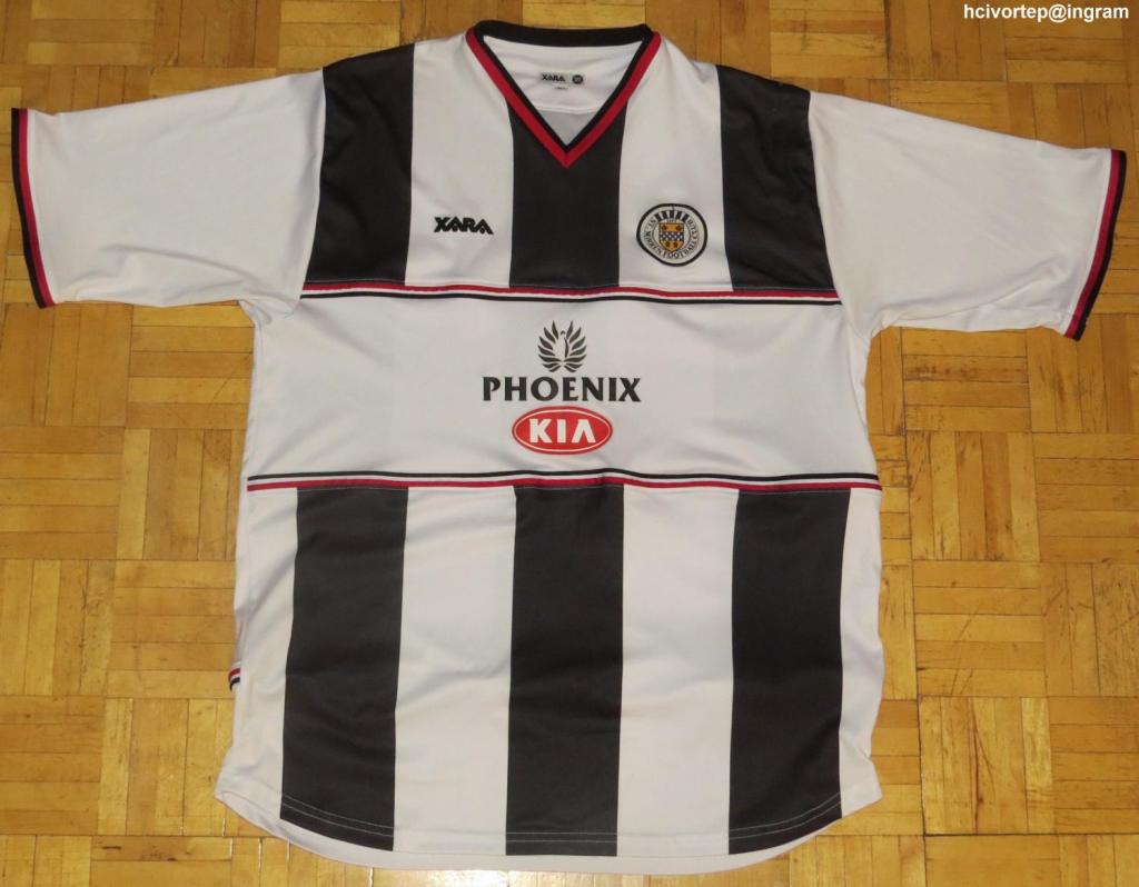
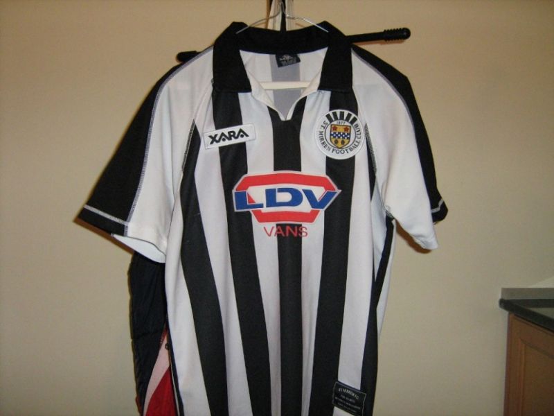
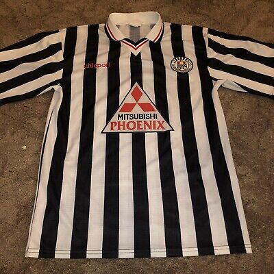
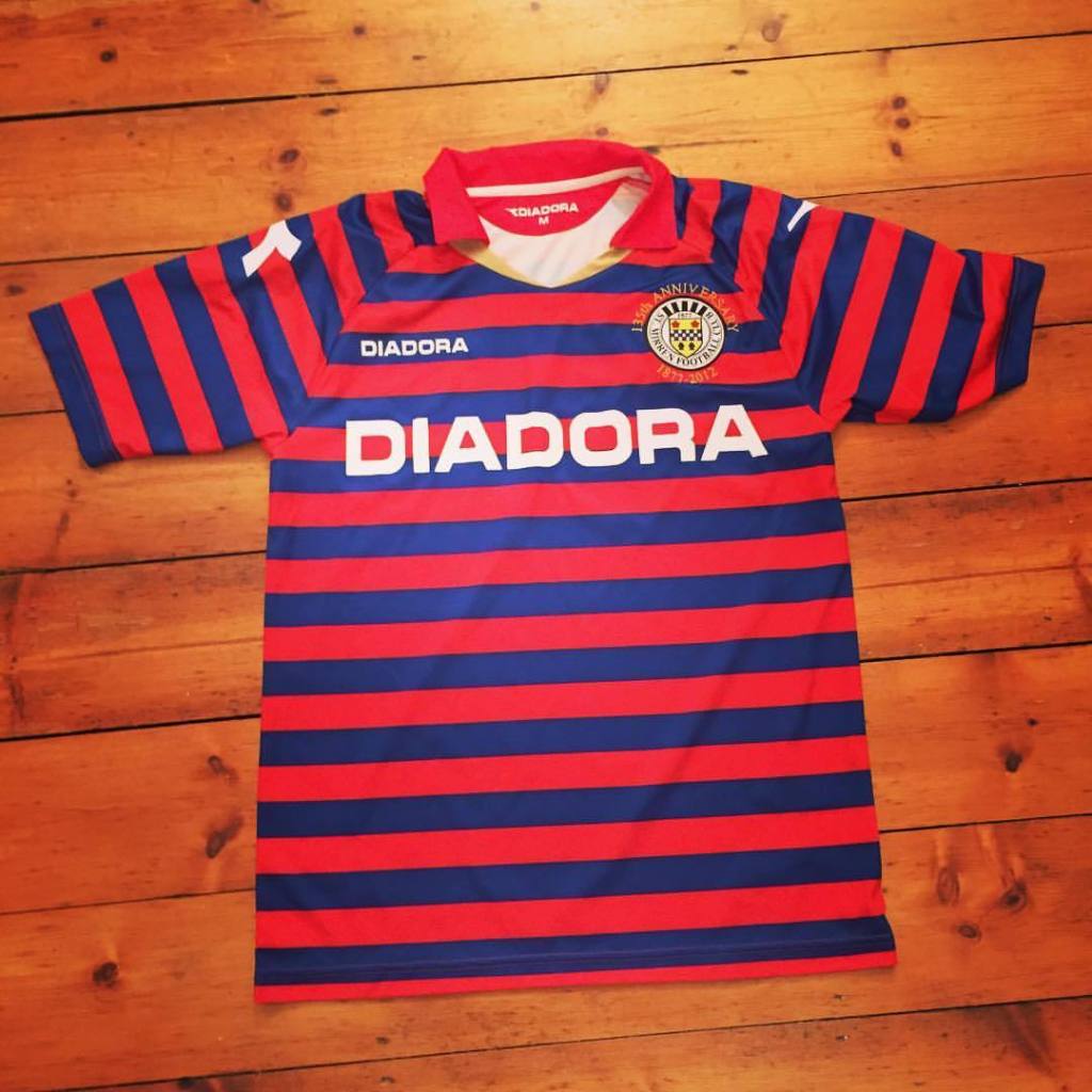
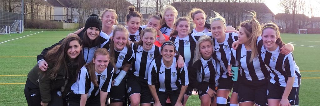
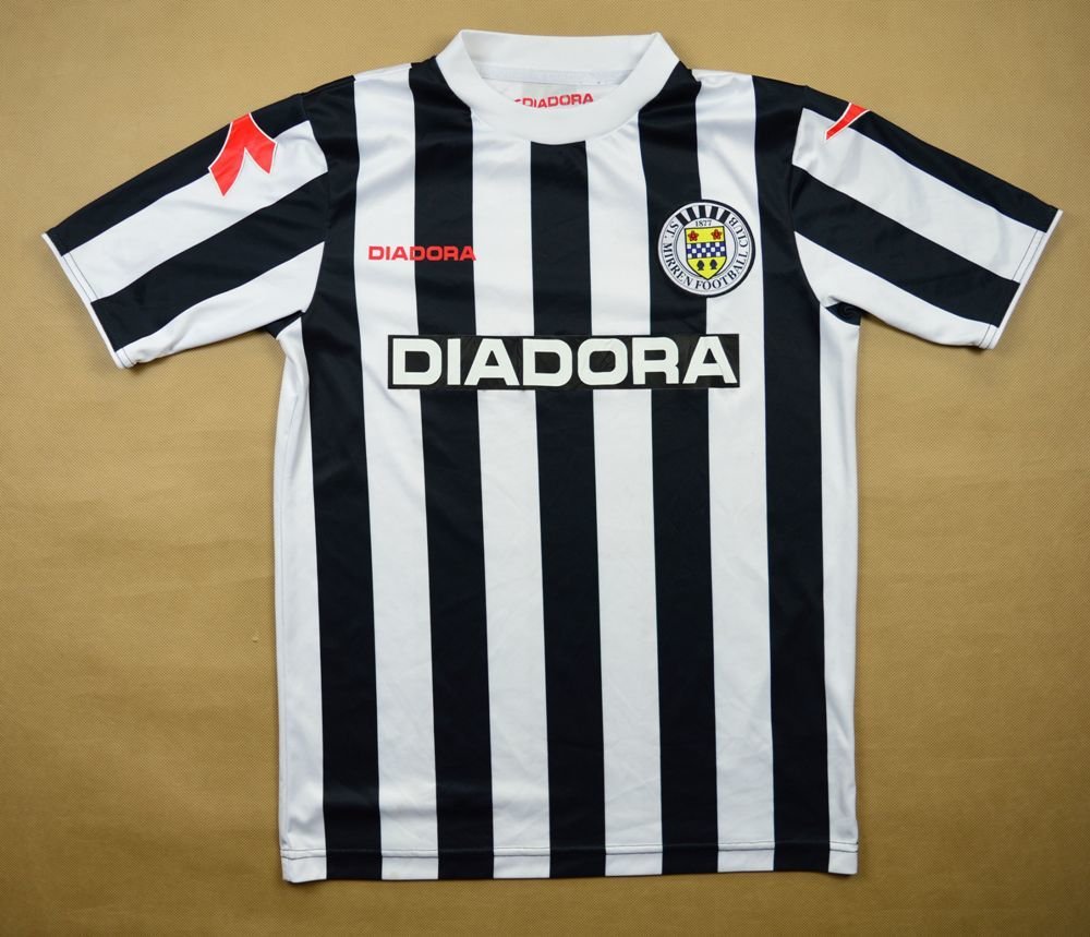
3. St Mirren

Black and white stripes – one of the finest kit templates in the game. For too many years now though, the design has been a wet salmon St Mirren have been unable to get a grip on. However, this Joma effort is lovely. A rare modern example of a sponsor adding to the aesthetic of the design. The grey accent on the trim of the sleeves and neck and the red of the Joma logo and shirt number gives it a real timeless feel. If I was to be hyper critical, I’d potentially say a crew neck would have suited the style better but – as St Mirren have repeatedly told me – my inability to pull off a v-neck is “not the club’s problem”.
2. Dundee Utd

In recent years, Dundee Utd have excelled in producing simple but effective variations on a theme. This – another stellar Macron effort – tears into the rulebook like Jim McLean vs John Barnes to produce something genuinely special. It’s everything a great kit should be – and a big win for the Shame Kits Aren’t As Mad As They Used To Be crowd.
1. Hibs

An Irvine Welsh reimagining of Memento (2001) where Hibs legend Derek Riordan has to rely on the map of Leith embossed onto this shirt to remind himself which pubs he’s still allowed to drink in. A truly beautiful kit!
And there we have it. A comprehensive and undebatable ranking of all 12 Premiership home kits. I will now resume resume my regularly scheduled programming of despising 11 out of those 12 teams. ALRIGHT BYE.